Artist’s Pick

Welp, even if I’m not doing so great at getting out there and taking photos right now, at least I’m still submitting things to shows here and there.  I’m happy to say that two more of my photos have been selected for another show at the Bowie City Hall!

This one was a fun one — artist’s choice!  So I went through a couple of my favorite photos from this year, and two out of three were chosen.  The other one was too large, unfortunately, but at least it was too large because they had such a huge response this time.  I’m glad that more people were participating in this show, because that always makes things fun!

So enjoy, and if you’re in the area on the 29th, stop by and check out my stuff!

Palladium Printing

Since I’ve been just terrible at keeping up with my 2016 challenge, I though I would get myself back on track by posting another project that I did in my Alternative Photography class this semester.  I’m about to take off to Florida again, so don’t worry, I’ll have plenty of new pictures, and I’m sure that will motivate me to get back into the swing of things!

Palladium printing.  Doesn’t that just sound yummy?  I love all of these old processes, and I’m so thankful that I was able to try out so many of them.  This was a particularly interesting demonstration/project, because we actually had a guest speaker/palladium printing expert come in and spend the class with us.  Robert Kozma is an amazing photographer, and it was great to have a talk, demonstration, and time to work with him.  We had a chance to view a wide variety of his work, which was truly beautiful; it’s clear that he has an immense understanding of the medium.  His work had a richness and crispness, while maintaining a warmth that simply made me fall in love with yet another process.  Unfortunately, I wasn’t able to find a website for him, but click around on my google search here if you’re interested in browsing around through various bits of his portfolio.  It’s well worth it.

This was quite the extensive class session, and one of the only times I would say that the allotted six hours was not enough.  I know, I must be joking, right?  But with trying to teach about 20 people a new process, coat paper, let it dry, expose, develop, and then give it another try, the time pretty much flew by.  Luckily, my friend and I were one of the first ones to get started, hence, one of the few who were actually able to test things out and make more than one or two prints.  With that, I have three of the same print.  It’s something that I’m not always fond of doing, since I was surprisingly happy with the first version, but I’m glad that I did it for this process.  We made some adjustments to the mixture of all the different chemistry involved, double coated some sheets of paper, diluted some mixtures with water, and changed exposure times.  It’s quite interesting just how different your print will show up with just minor changes to these things.  I also have one single print, which was just an experiment with a piece of paper which we didn’t finish coating.  It’s a little lighter than I would like, but I’m glad I tried it out anyways.  Aside from this being an expensive material to waste, which I hate doing, it’s great to see a more drastic variation as a result of chemistry application.

The photos themselves were taken the last time I was in Florida.  My friend and I always like to try and venture out to interesting little (free) places, and we stumbled upon Lake Eola.  I wasn’t quite a fan of the idea of just going to a lake that was clearly amidst a bunch of office buildings in the middle of Orlando, but I was intrigued by the fact that there was supposedly a ton of swans at this lake.  I have to say, I was not disappointed.  There were tons of swans!  As soon as you enter the park, they’re lounging in the grass and bushes, swimming in the lake, and are not shy about being around people, or even coming up to you.  With that, I was able to get some pretty good close up photos of them, as well as the ducks and other birds at the park.  If you’re ever in the area, and want a relaxing place to hang out an enjoy the sights, I would recommend it.

So here are my prints, aka, four more reasons why I want to take this class again!  I’m in love with them all for different reasons, so you be the judge.  Which one wins out?  Enjoy!

Van Dyke

Well, it looks like I’ve taken too deep of a breath while relaxing after this semester, and have fallen off the grid a little with my blog.  Sorry!  So to make up for it a little, I thought I would share some of my favorite photographs from my alternative processes class this semester.

I have to say, if I haven’t already, this was my favorite class I took this semester, possibly my favorite that I will take while at MICA.  Just having the resources to learn about different processes, and then not having to buy the chemicals and try to deal with them in my less than acceptable home set up was pretty amazing.  I’m considering auditing this class again because I loved it so much, but we’ll see — the rest of my “MICA career” seems like it’s going to be a little crazy.

One of the things we learned about was the Van Dyke process.  I’ve experimented with a similar process in the past, Kallitype, which I came to learn is basically the same process, with just a slight difference in chemistry.  At least I had a little heads up with what I was going to be working with, which was good.  This chemistry is nothing to mess with — I messed up before, luckily just a little, but my hands were stained brown in little spots for about a week.  Come to find out, it can last much longer than that, so I got off easy.

Since I was stuck on the nature theme for this class, I thought about some old photos that I’ve shown you guys before, that I did during a still life exercise for my Digital I class last semester.  I’ve been in love with these photos since then, and I was happy to try them out in a different process.  I feel like when I do alternative process printing, I have a different aesthetic that I go for.  I like the more “oddities” and “antique” looking subjects.  Nature always works, too, but I’m really happy when I can combine the two, and I feel like these photos got it.  Maybe that’s why I like them so much.

Aside from these being my favorites, this process also worked like a charm in the class.  I had a little trouble with the cyanotype processing, which was disappointing, and palladium (which I’ll show you soon!) was a really time consuming process, which took a little of the fun out of it.  With the light boxes in class, these worked quick, and turned out great.  I used Arches Cover paper, and really enjoy the result I got from it.  There is a bit of a waiting process, if you’re thinking of trying this out and don’t like waiting.  Per suggestions made by my professor, it’s best to double coat your paper, waiting at least a day or two between coats, and then waiting an additional few days before printing.  This allows the paper to really absorb the chemistry, and will provide you with a wide range of tones once you get to printing.  So I coated during one class, had a class mate do the second coat a few days later, and printed the following week.  I’m not patient, but if that was the key to these, I guess I’ll just have to get used to waiting when I try this again.

So here they are!  Let me know what you think.  I’m in love with them, and can’t wait to do some more.  Maybe I can sneak in over the summer and do some printing?  I may just have to find out if that’s a possibility.  Enjoy!

Week 16: Portrait – Movement

Ah, finally, I can breathe.  Did you miss me?  Just as I thought I was going to be able to stay on top of things, finals struck with an iron fist, and things got crazy.  I’m happy to say, however, that I survived, and I’m happy with all of the finals I completed.  Now, I’m just anxiously awaiting my grades…for what seems like an eternity.  But I’m free!

Even with falling behind, I’m happy to say that again, I’ve wound up making something for class that completely fits in with this challenge.  Is that cheating?  I’m gonna go with no 🙂

So for my Alternative Photography class, I’ve been making work that’s about nature the whole semester (don’t worry, I’ll share it with you soon).  As a final project, I really wanted to print larger than the typical 8 1/2″ x 11″ negatives that we’ve been printing, but I knew I had to do something great to make a single print final worthy.  So instead of just taking some photos of flowers or birds, or whatever I’ve been working with, I decided to photograph “mother nature”.  I like how inspired I’ve been feeling these last few weeks.  Cheesy sounding, I know, but it’s been great letting the ideas flow.  So I had this picture in my mind of how I wanted to photograph “her”, and off I went.

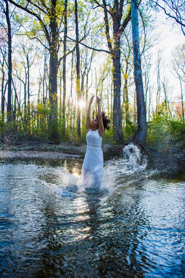
Another perk experienced for these finals — I had tons of models!  It was amazing.  Between the three classes, I had eight, one of which, Brittany, I used for this project.  We went to my favorite little stream that I’ve used on a few other occasions, and dressed in white, with curly hair, and the sun setting, it was everything I wanted….almost.

We started shooting, and something just wasn’t quite right.  We tried different angles, and played with the light, but it just wasn’t what I was thinking.  The rocks were killing our feet this time, so we decided that we should just pack up — I had enough to work with, although it wasn’t perfect.  For some reason, she stayed in the water while I got out, and when I turned around to see why she was still standing in the same place, it was perfect – -the sun was setting nearly directly behind her, the air was glowing in that yellow light, and I knew that was it!  So she splashed in the water, again, as she had been before, and after a few composites of splashes, I had this: exactly what I was thinking.

DSC_2979 (2)

I would have loved to be finished at this point, to be honest, but I had a lot more work to do.  At least I’m excited about this process, regardless of how busy and crazy finals are.  Originally, I wanted to do a duo-tone, combining cyanotype with Van Dyke, but, nothing is ever easy with me! After a couple of test prints at school, I couldn’t get the first step, cyanotype, to work, so I decided to take everything home, and do it the old fashioned way; with sunlight.

Did I mention the other struggle of printing this image?  Large.  When dealing with 8 1/2″ x 11″ sheets of transparencies, that means you’re going to have to piece a bunch together to get a big image.  In this case, I ended up working with 9 negatives to create this one image, lined up, side by side, over and over again, trying to make this as seamless as possible. Luckily, with the help of my boss at the framing shop, I was able to get a large piece of glass and foam core to make things a little easier, but it was still a difficult task.  So on the one sunny day we had last week, outside I ran, trying as quickly as I could to get this complicated negative all lined up.

2016-05-02 13.01.23-2

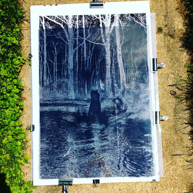
baking in the sunshine 🙂

A successful batch of three prints done and on to the next phase.  Since my original idea of duo-tone wasn’t possible at home, I decided to go with another method; toning.  After seeing the prints, I really didn’t want to tone them, because some of the blues and highlights turned out so great, but I thought I should since that’s what I told my professor I was doing.   I’ve done some work with tea toning in the past, but he suggested trying coffee, so I thought what better time to try something new.  After having tried both now, I have to say, I should have stuck with something I tried before, because this coffee method took forever.  However, it did give me the look that I was going for, well, for the most part.  In case you’re wondering how it all works, honestly, there’s a million different methods and toners you can use.  In this case, I went with instant coffee in warm/hot-ish water.  After a pre-soak, I left the print in the coffee bath for about an hour.  After it wasn’t reaching the tone I wanted, I decided to bleach the print, using actual bleach diluted in water.  This isn’t the preferred method of bleaching, because it eats through the paper if you leave it for too long, but it’s what I had, and it works if you keep an eye on it.  So after that was lightened,  I put the print in another coffee bath for about an hour, and there you have it.

I love the strange color that I got from this whole coffee/bleaching process, but I’m also glad that I left a few of the prints alone.  Here’s both of them, so you can tell me, which do you prefer?  I’m still undecided.  Enjoy 🙂


Driven to Abstraction

Well, I’m happy to say that I’ll be showing a few more pieces in another exhibition!  It seems like things for these photos just fell right into place.  They’re actually from a project that I did earlier in the semester, centered around “the decisive moment” and composite images.  I was at such a loss for what to do with this project, and I tried a million things.  Finally, I decided to do something a little bit different.  So I started experimenting with color, and light, and dropping bits of food coloring and milk (yuck) into a small fish tank that I have.  After about 700 photos, yes, count ’em, seven-zero-zero, I had enough photos which had compositions, colors, and clarity that I was happy with, and started piecing them together.

Once the editing and construction of these images started, I really tried to hone in on making them representational of something more than just color and movement.  The end result was five images that express different emotions and feelings, represented as my imagining of chemical reactions which take pace when these feeling occur.  They were far more abstract than anything I’ve done before, but these were a lot of fun to work on.  The only thing that was a little disappointing about this whole process was the critique.  While people liked them, and said they were “visually pleasing and interesting”, I expected a little more from a group of students at such an open-minded art school.  They totally didn’t get it.  I had to explain it, thoroughly, and then some people still weren’t seeing it.  At least my professor was on my side; he literally had to break it down to them and say hey, even though these are abstract, they’re still valid, and you should critique them the same way you would any other representational photo.  Nice try, the class was still a little stubborn, but oh well.  In the end, I’m happy with the images I produced, and apparently, other people are too!  So here are the three images that will be on display:

The show is put on by the City of Bowie Arts Committee, and will be on display at the Bowie City Hall from April 23rd through June 18th.  I’m super excited to have my work in another show, and can’t wait to see all of the other work it will be on display with.  So if you’re in the area during that time, you should stop by and see it, or even buy something!  And if you’re curious as to what the other two pieces were for the project, here they are.  Enjoy!

Week 15: Rebirth

Can you believe it?!  I’m all caught up on this challenge!  Who’d a thunk that while amidst the planning of finals and and completing projects that this would be the time I caught up, but here I am.  And I couldn’t be happier to be caught up with a different theme or photo.

Rebirth.  It can mean so many different things in so many different contexts.  It’s a word that has had a particular significance to me over the past two years, so I’m always happy to do some work surrounding this theme.  And even better, it coincided with a project that I was competing for class.  You know I love it when I can hit two birds with one stone!

The project that we had for class surrounded the idea of “constructed reality”, or tableau photography — creating a scene, world, scenario which does not occur naturally, but in a strange way, could possibly happen.  Playing with the border between truth and fiction.  That’s the best explanation I can give for this, because honestly, I had a terrible time thinking of something to do for this project.  The examples my professor gave the class were vast, which was equally helpful and harmful.  Just as I thought I was getting a grasp on what he was asking for, a whole other group of artists would come up which were completely different, and I would be thrown off again.  Don’t get me wrong, I always appreciate the broad overview of example artists he shows us — they have amazing work.  Some of my favorites, which you should go check out, were Duane Michaels, David Hockney, and (this one’s a little creepy) Joel-Peter Witkin.  Three very different styles, three very different conceptual minds, and three equally awesome artists.  So, in wanting to emulate all of them, and not sure how one single idea could encompass that and the parameters of the assignment, I was stuck.

The night before I had to bring in “progress”, I still had nothing.  All day during my classes I was trying to think of something to do for the next day.  I had a bunch of ideas, but nothing feasible this short notice.  Ah, the blight of wanting models in my photographs.  So I dug a little deeper, and this idea came to me, finally.  It was actually something that I had thought of during one of my film photography classes, but for some reason, filed it away in my “will probably never happen” group of photography ideas.  I’m really glad I decided to drudge it up and give it a try.

This whole idea started when I first returned back to school, and was debating leaving my old job and finding something that would actually make me happy.  I wish I could say it was at one of my hardest times, and that things got better from there, but I’m just now starting the incline again.  Even then, however, I would dream about how great life could be, and what it would feel like to let all the stress and drama of my then current life behind.  Flowers and nature have always seemed like a great avenue for me to express a lot of complex ideas, and this project made good use of that.  In correlation with this feeling of wanting a new life, and now revisiting it from a perspective of “rebirth”, along with having gone through some major changes, I wanted to be able to express both the pain and beauty in changes simultaneously.

Although it may be a little unsettling to look at, I really am in love with the result I achieved.  I needed something visceral, raw, an essentially disgusting, to really describe how difficult things have been.  On the other hand, I was dreaming of a new, beautiful life, and since then, have made large strides to work towards it, and wanted an element which would exemplify that sentiment as well.  I chose to place the wound (which was incredibly, surprisingly, easy to make) on my wrist.  I think location is meaningful in itself, as many associate this type of wound with self-harm, and in a sense, living the life I was living was doing exactly that, killing me.  The flower that I chose, Star of Bethlehem, though possessing religious connotations which I didn’t not directly relate to this project, represents all of the things that I imagine this new life, or rebirth, will bring.  Hope, for a better life.  Forgiveness, to myself for not doing this sooner.  Honesty, to stay true to myself.  Innocence and Purity, for all the good, new things, untainted by my previous life.

I love it, and I’m even more excited to keep working on this type of imagery.  I’ll be extending this work for my final, so maybe you’ll see a little more of this soon, ya know, if this doesn’t gross you out too much 😉

rebirth

Another Case of The Blues

Remember when I mentioned that I was going to use some photos from my black and white landscape week to print Cyanotypes?  Well, I finally have them scanned in a ready for you!

You know I love working with cyanotypes, and it was great being able to work on some more through my class.  I mean, I didn’t even have to use my own chemistry, and I got to test out some new papers, so as photo geeky as that may sound, it was super exciting.

While I just shared a few photos before, my theme for this project was “trees”.  I looked at them from different angles and tried to show some unusual details and abstractions of a subject I work with all the time.  Of course, I used the photo of my favorite tree, because, I just love that tree.  I also took a couple close up shots of some cherry blossom trees around my house.  They had some weird textures and growths on them that I thought were really interesting when viewed from a very close range.  One of these images really makes me think of this crazy movie that we watched in one of my classes, Little Otik, because, you know, art school and crazy movies go hand-in-hand.

As for the process, things were a little different, and took some getting used to.  Can I say that I’ve been spoiled by the sun?  I’m pretty confident when printing outdoors, and took that confidence with me to class that day.  Unfortunately, the light boxes are entirely different as far as developing times, and have a few other quirks.  I kind of over exposed one print to the point where you could see the outline of where the lights were in the box…I’m not gonna show you that one, but you can take my word for it 🙂  After I got the hang of it, however, it was pretty amazing.  Amazing like…I need to figure out how to build one of these myself so I can print at home on rainy days/at night, amazing.  That’s been the only sad thing about this process for me; I’m limited to sunny days, which don’t always come often during the colder months.  This is just one more thing for me to get attached to while at school.  I guess I better appreciate the things I have access do before they’re gone.  It’ll be over sooner than I think!

So with the quirks of getting used to new things, these aren’t quite the best cyanotypes I have ever made.  I’m still pleased with them though.  It was great having a chance to do this process again, and also great to get out and visit my favorite tree 🙂  Maybe I’ll give them another go over the summer, but for now, enjoy!

Week 14: Zoomed In Landscape

So I decided to take a different approach to a favorite subject of mine for this week’s theme — the beach!  That’s right!  I’m still holding on to the last of the “vacation photos” to work out some of these themes.  To be fair, I did take these photos while I was there with the intention to use them for this challenge, it’s just taken me longer than I would have liked to get to them.

Instead of taking the typical rolling landscape, or seascape rather, photos of the beach, I tried to look at different aspects which would usually go unnoticed.  While I do walk around in a day dream a lot of the time while on the beach, I also pay attention to the details.  For some reason, I don’t usually capture them.  I have to say, I do make a serious effort sometimes when out and about to just enjoy where I am, so I intentionally try to not get caught up in taking photos of everything.  Maybe that’s why these details have gone “uncaptured” for so long.  This particular visit, I just couldn’t pass it up.

It started with me wanting to capture a vertical oriented, bird’s eye view type photo of a wave washing up on shore.  I worked on it for a while, trying to get just the right angle.  After getting that, since the camera was already out, the day dream phase of that walk on the beach was over, and I started paying closer attention to some things I had noticed earlier.

In Daytona, the beach is surprisingly flat.  Maybe that’s because I’m so used to the Ocean City beaches, which due to erosion, have to be rebuilt each year and have a much steeper drop off.  So when I’m walking on this amazingly flat beach, I’m always captivated by how far you can walk out in the water and have it still be below your knees,  as well as all of the interesting things going on on the beach.  There are a lot more shells and sea critters, and like this trip when it’s a little rainy, there are a lot more interesting shapes in the sand.  I’m not quite sure what caused all of these patterns, but as I was walking and enjoying the view, I was also taking mental notes of interesting patterns to return to on the way back.  I mean, ok, it’s the waves and the crabs doing this, obviously, but I over think things.  I try to figure out just how the water could have done whatever it is that I’m looking at.  I should probably just enjoy it, and not over analyze.

So, the crabs, bubbles, and gentle waves were causing all kinds of patterns and abstract looking “compositions”.  Instead of just focusing on the sea and wider landscape, I decided to zoom in on the little details.  I kept the same methodology as my wave picture, and shot nearly everything by looking directly down and zooming in as much as possible.  I have to say, this is one case where I wish I was taller.  Even though I’m trying to get close up details, I’m a little short, so it’s hard to get a good focus and fight the urge to hunch over.  It was fun looking at things from this view, and I saw plenty of interesting patterns along the way.  I did have to run off the beach before I was quite finished, since a storm was quickly approaching, so I think I’ll keep working on this, and different views of the beach, on my next visit.  Let’s hope that’ll be sooner than later 🙂

Week 13: High Key Portrait

Don’t you just love when you get to do something that you like, and it just kind of falls in your lap?  I do, and you know I don’t need anymore complications with how crazy this year and all this school work has been.  I’m happy to report, that’s what happened with this week’s theme.

You may say, “but Rachel, how is this easy?  It involves people!”  Yes, dears, it does, which was my original hesitation when I saw what I had to do.  It’s alway disappointing to have so many ideas floating around in my head, and no one to participate in them.  But, with my successful environmental portrait the other week, I decided to start taking my camera with me whenever I can, or at least a little more often.  So even though I though that brunch at my aunt’s house would be uneventful in the photography department, I was wrong.

My poor family.  Always subject to help with my photo projects weather they’re willing or not.  They just see me with he camera or setting up something crazy, and I think, have this feeling deep down that it’s just a matter of time before I ask them to do something.  I gotta say, I kept my cool this time.  Quiet little camera bag sitting under a chair off to the side of the Easter morning/afternoon brunch festivities.  No pictures (well, other than cell phone ones) of the food, and the egg dying, and the regular craziness that we do when we’re together.  My parents left…nothing…my brother left…still nothing.  Just waiting.  Besides, I already knew who my target was…

My grandmother is always so funny when I take her picture, and today was no exception.  After everything was pretty much over, she, my aunt, and I went out to the backyard and started looking around at whats popping up back there.  As they started on tidying up the yard, I started snapping a few pictures of the greenery.  Then I asked to take her picture.  “Aye!  Not pictures again!  What do I have to do this time!?”  She was yelling, but she was joking.  Secretly, she has fun working on things with me, even if it is a little annoying.  I think I scarred her for life with a project last semester — it was a long exposure, and she had to hold her hand very still while moving her body away.  Needless to say, we did that just about a million times, and saying she was happy it was over would be an understatement.  For everyone’s benefit, I kept it nice and simple this time.  She was happy to hear that she just had to stand there.  Once my aunt saw, however, she started teasing her.  Of course, since I wanted to go for the serious/neutral face, she had to make my grandmother laugh.  It all worked out in the end, and just for my aunt’s goofing off, I took some photos of her as well.  I’m glad I got the shot that I wanted of my grandmother, but I’m also glad I got the silly ones of the two of them together.

And did I even mention the other part of this?  High key.  You guys get it.  You’ve seen it all before last year when I did this.  I was happy to revisit it, and to try it with people.  Glad they’re always willing to put up with my “crazy photography projects”. 🙂  Enjoy

Week 12: Seasonal

So I’m pulling another theme from my alternate list this week, because, ya know, I wanna 🙂  You know I love the chance to talk about all things spring and summer, and since the alternate list has this week’s theme as “seasonal”, I’m all about it!

Going to Florida always gets me a little out of whack weather wise, but I’m happy to report that things have warmed up around here.  We may be looking at a cold front for the rest of the month, allegedly, but I’ll take a cooler spring over two feet of snow any day.  Even with the chillier than normal temperatures, it’s been warm enough for the world to blossom, and I’ve been happy to enjoy it and capture some springy moments.

First, let me start with a little ode to the cherry blossoms…

They’re always some of my favorites.  I wish they would last a little longer, but with the first windy day, they’re gone.  I’m happy to have had a sunny day off where I got to wander around a little and snap some photos.  It was actually one of those windy days while I was photographing these, so it was a little difficult to capture a clear image.  Luckily, I did, and I was also lucky enough to snap a few of the baby bumble bees which were fluttering around the blossoms and fighting the wind.  Poor little things — they would be there one second, happily bouncing from flower to flower, and then woosh!  A huge gust of wind would come, and they’d be gone.  They’re tough though — they made it back 🙂

As for some of the other flavors of spring, you always get the same first visitors; daffodils, hyacinths, and the cute little “weed” flowers, you know, from the weeds that grow in the grass….not that…I’m not talking about that!  But while I was on vacation a couple weeks ago, and at the Bok Tower Gardens, I took advantage of the garden part of that visit, and took pictures of the gorgeous things they had in bloom there. It was really a fun place to see, and you should check it out if you’re in the area.  According to their website, something is always in bloom, and I wouldn’t doubt it; the weather there is perfect for year-round blooms.  While I was there, I’m pretty sure I was fortunate enough to make it during one of their peak bloom season, and among other things, was able to enjoy their Japanese Magnolias, Camellias, and Nun’s Orchids.  It was a beautiful walk, and smelled amazing!  Even as we were a few minutes away and driving up to the gardens, you could smells the flowers.  So while I’m dreaming of warmer weather on this chilly spring night, enjoy these photos of the little promises that warmer weather is right around the corner!